Created using Adobe Indesign
2023
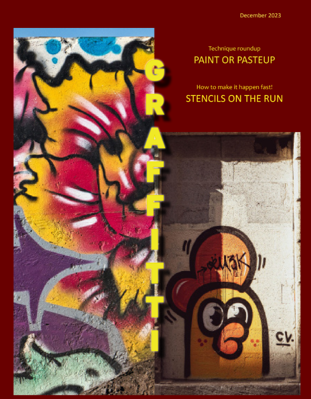
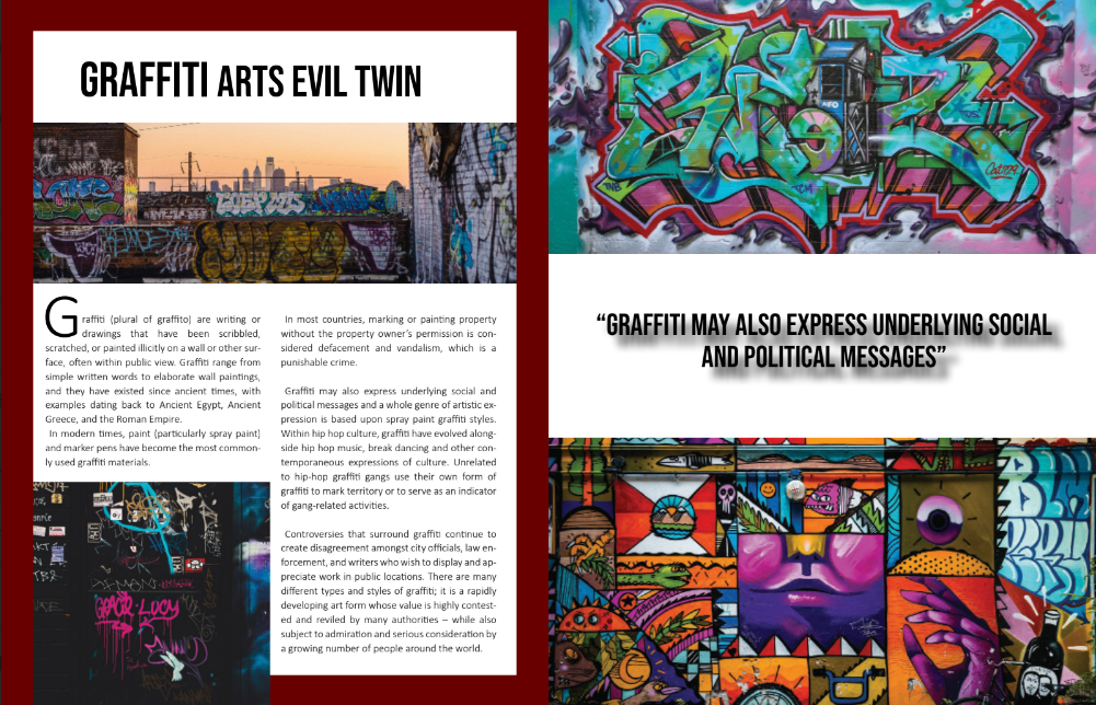
This is a magazine cover and spread I created in Adobe Indesign. My main focus on this project was to develop a graffiti-based magazine with inspired graffiti artwork, a simple definition of graffiti, and some context behind it. For the texts, I used two fonts, “Calibri” and “Canadra,” on the title and quote within the spreads because I found them to be simple to use for the text, and I used “Bebas Nue” to emphasize the importance of the title and the quote as I wanted these to stand out. I picked the color red because I was inspired by a magazine I saw long ago but can't remember its name, and it just popped up in my head. The red color would add a fancy magazine look, so I used it. For the title of the magazine cover, I used the color yellow because I wanted it to glow out, as it is one of the most important parts of the magazine. I was given a variety of graffiti pictures but decided to use the images I used within the magazine because I found this type of graffiti to be unique in my own eyes. These images relate to urban graffiti because they are created in different parts of the world in cities. For example, one of the photos includes graffiti on top of a building's roof. Graffiti art like this is common. A lot of buildings, especially on their roofs, contain graffiti. When I take the subway, I can see that graffiti like this is very common.